
Subtitle style
Font, size, color, outline, shadow, background—tune both primary and secondary subtitles for maximum readability.
Readable subtitles keep you watching. Primary and secondary subtitles can be styled independently—they don’t get in each other’s way.
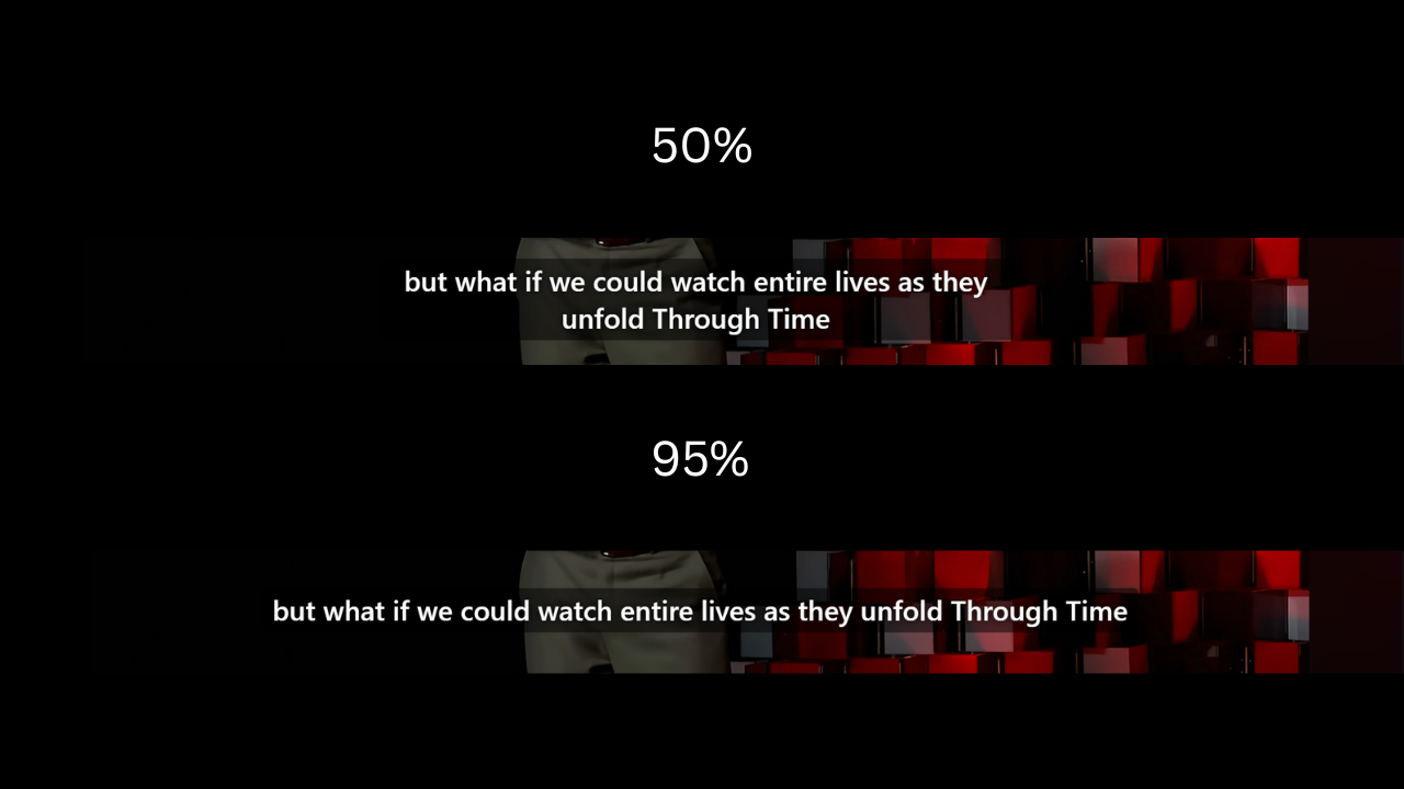
What you can adjust
In the Settings tab, configure primary and secondary subtitles separately:
- Font, size, weight
- Text color, outline (stroke), shadow
- Background color and opacity
- Letter spacing, line height, padding
Want white text with a black outline, or karaoke yellow? You can do that.
Faster approach: use a preset
Tweaking every option takes time. If you just want something that looks good and reads well, open Style Studio, pick a preset, and apply it in seconds—you can fine-tune later.
Tips
- Primary subtitles usually work best a bit larger with stronger contrast—they draw the eye.
- Secondary subtitles (translations) can stay subtle; look when you need them.
- Want a more distinctive font? Use Google Fonts.